Reduced executive onboarding time by 75% while navigating organizational chaos
When organizational layoffs eliminated my primary users mid-project, I redesigned the solution to accommodate resistant stakeholders—ultimately processing 350+ executive profiles in the first year.
Project Journey
Context
The Problem
When a new executive joined the organization, the onboarding team manually created a 40-page PowerPoint presentation—taking 8 hours per profile. The process was fragmented, non-standardized, and increasingly unsustainable as executive hiring scaled.
But the real challenge wasn't just digitizing a manual process. It was navigating organizational politics, adapting to sudden team layoffs, and designing a solution flexible enough to accommodate users who actively resisted taking ownership of the work.
Why This Matters
With executive hiring accelerating, the manual process would have required hiring additional full-time staff. The company needed a scalable solution—but organizational politics would make that far more complicated than anticipated.
Discovery
Starting with the Wrong Users
I partnered with the Product Owner to design a research plan and conduct stakeholder interviews. Our main stakeholder provided us with users to interview: Onboarding Partners who served as the point of contact for new executives.
What we didn't know at the time: these weren't the people who actually created the 40-page documents.
Research Methods
Research Synthesis: Pain Points & User Quotes
Through our 15 stakeholder interviews, clear patterns emerged. I synthesized findings into four major pain point themes:
Manual Process
"I'm spending 4-6 hours manually creating each executive profile. It's extremely time-consuming."
— Onboarding Partner
"We're a tech company and I have to create PowerPoint PDF files? This feels outdated."
— Onboarding Partner
"I'm copying the same company information over and over for each new executive."
— Onboarding Partner
Lack of Automation
"Why can't we automate some of this? We have employee data in so many systems already."
— Onboarding Experience Owner
"I have to manually look up contact information from multiple sources and type it all in."
— Onboarding Partner
"Every time someone's title changes, I have to update the document manually."
— Onboarding Partner
Version Control Issues
"Sometimes data gets overwritten and it takes forever to recover through version history."
— Onboarding Partner
"Multiple people edit the file at once and I lose track of who changed what."
— Onboarding Partner
"Files get passed around via email with names like 'Executive_Onboarding_v3_FINAL_FINAL.pptx'."
— Onboarding Experience Owner
Coordination Effort
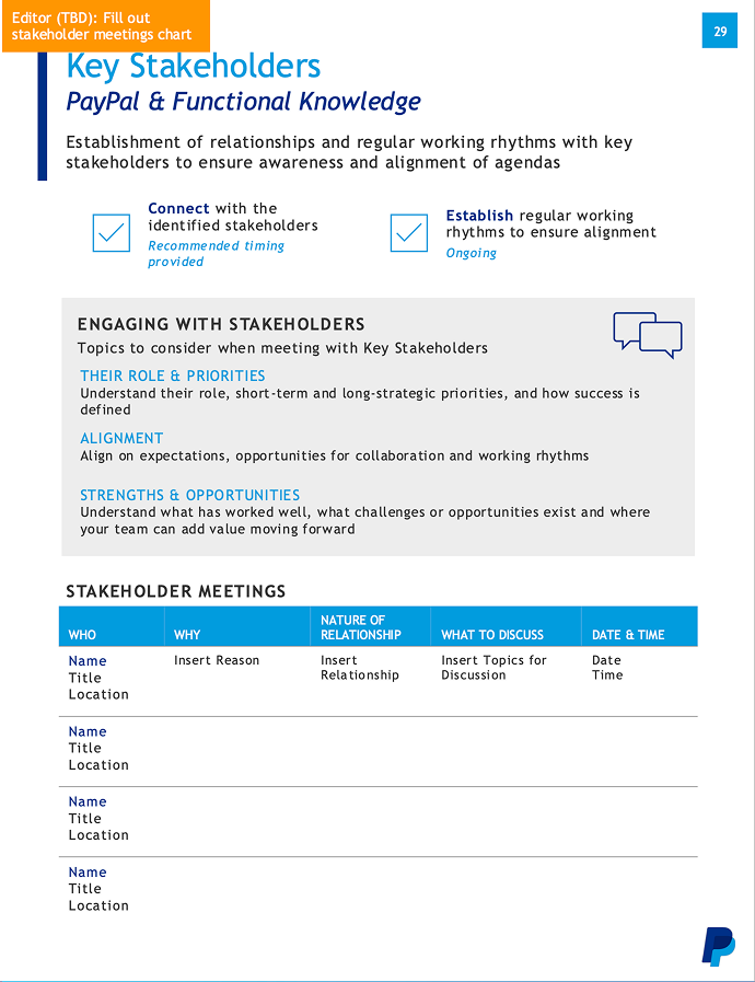
"Coordinating meetings takes enormous effort to align everyone's calendars."
— Onboarding Partner
"There's no visibility into who's working on what section of the profile."
— Onboarding Experience Owner
"I spend hours in back-and-forth emails just to schedule a single stakeholder meeting."
— Onboarding Partner
Current State Process Map (Before Solution)
End-to-end workflow from executive hire to profile delivery - highlighting pain points and handoffs across departments.
HR notifies Onboarding Partners of new executive hire
Open 40-page PowerPoint template, add executive name and basic info
Manually identify which departments own which information, then coordinate meetings for the executive's first weeks/month
Request org chart, direct reports, key stakeholders, department contacts
Insert onboarding materials, company policies, helpful links
Send draft via email, collect feedback, manage conflicting edits
Export PowerPoint to PDF, email to Onboarding Partners for delivery
Key Insights from Process Mapping
6 different departments involved with no centralized coordination
50% of time spent on coordination and data gathering (not actual content creation)
No visibility into which sections were complete or who was working on what
Ideation
Exploring Solutions
Design Principles
Based on our research insights, I established three core principles to guide the design:
Progressive Disclosure
Break the 40-page monolith into digestible steps. Show users only what they need, when they need it.
Flexibility Over Rigidity
Design for variability. Not all executives need the same information—the system should adapt.
Reduce, Don't Eliminate
Respect users' need for quality and customization. Automate repetitive tasks, but preserve control over executive-specific content.
Concept Exploration
I explored several approaches to structuring the information:
Single-Form Approach
All 40 pages in one long form. Rejected: Too overwhelming, didn't address cognitive load.
Category-Based Sections
Group by information type (IT, HR, Facilities). Rejected: Didn't match mental model—users think in terms of "what the executive needs" not "which department owns this."
Sequential Workflow
Step-by-step process mirroring the natural onboarding journey. Selected: Matched how users already thought about the process.
Design Process
From Research to High-Fidelity
Information Architecture
I conducted a systematic content audit of all 40 pages, categorizing by data source, update frequency, and user input requirements. This analysis revealed that 82.5% of content was static and could be templated, while only 7 pages required dynamic user input.
Content Audit Analysis
40-page manual overview
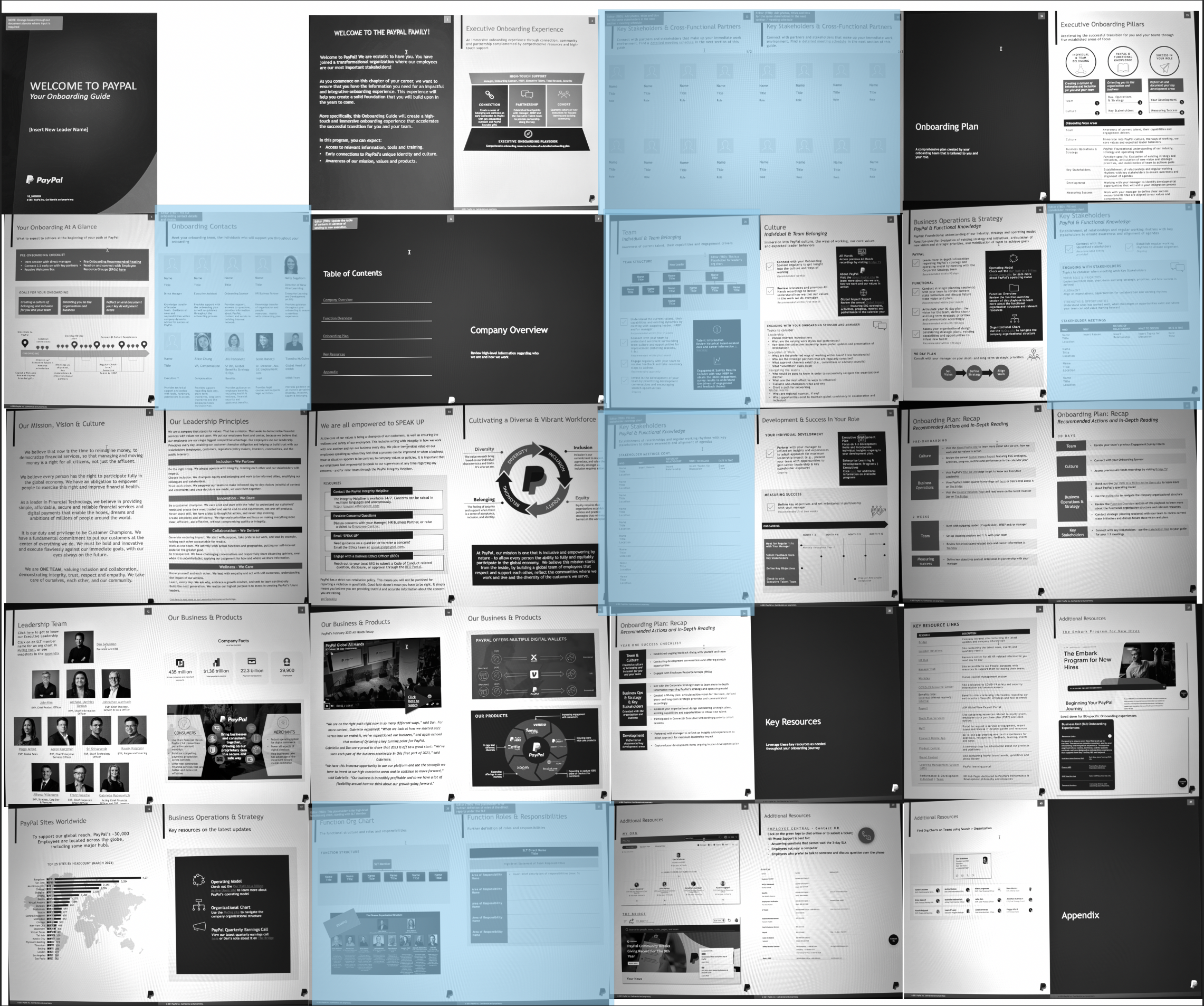
7 dynamic pages (highlighted)
Audit analysis spreadsheet
Moved to SharePoint templates
Built into PowerApp workflow
Rationale: By focusing development on the 7 dynamic pages that required user input, we avoided building unnecessary automation for content that rarely changed. This strategic approach reduced development complexity while solving the core problem.
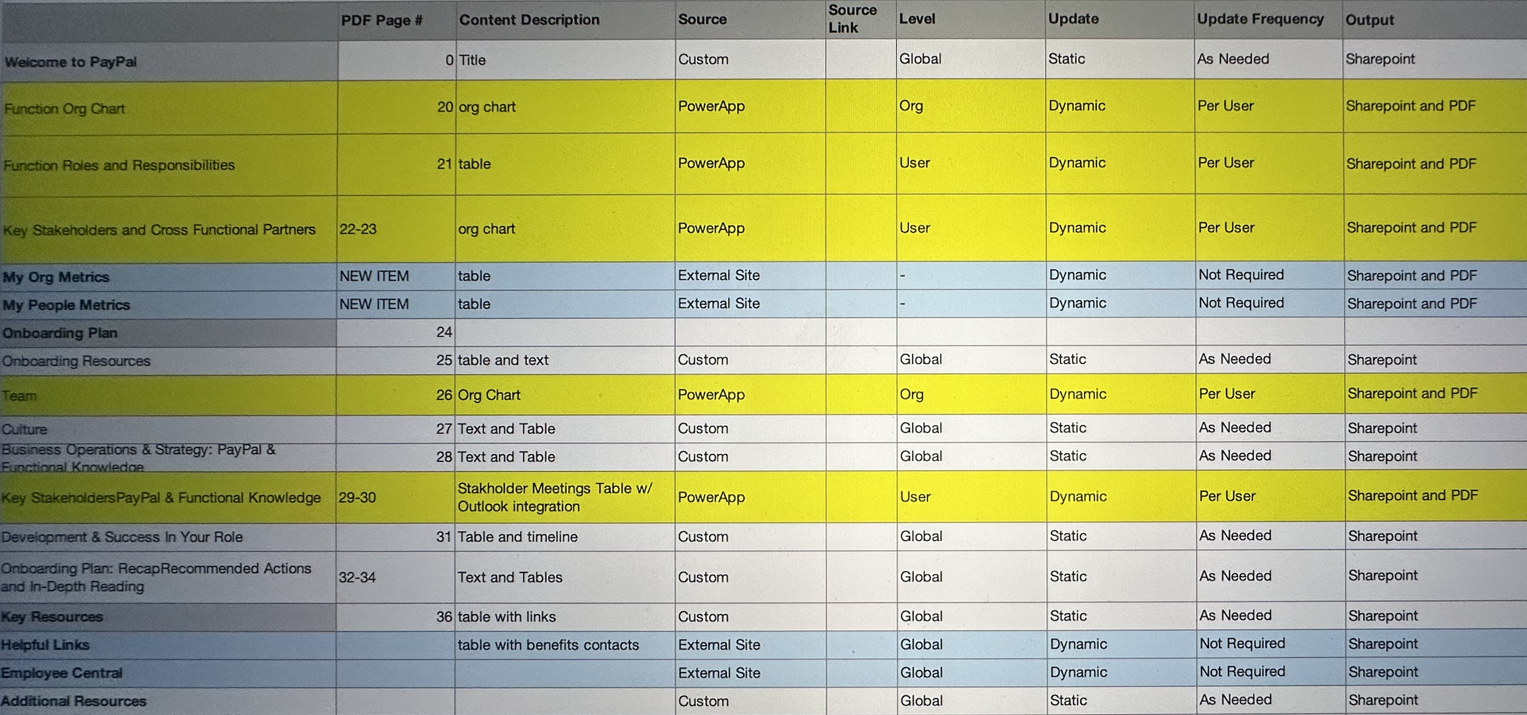
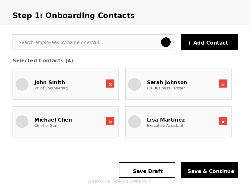
Low-Fidelity Wireframes
I created wireframes to test layout patterns and information hierarchy. The key challenge was breaking down complex forms into digestible steps while maintaining workflow continuity.
Step 1: Onboarding Contacts
Step 2: Key Stakeholders & Partners
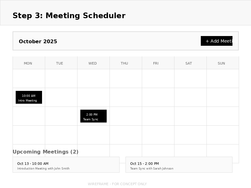
Step 3: Meeting Scheduler
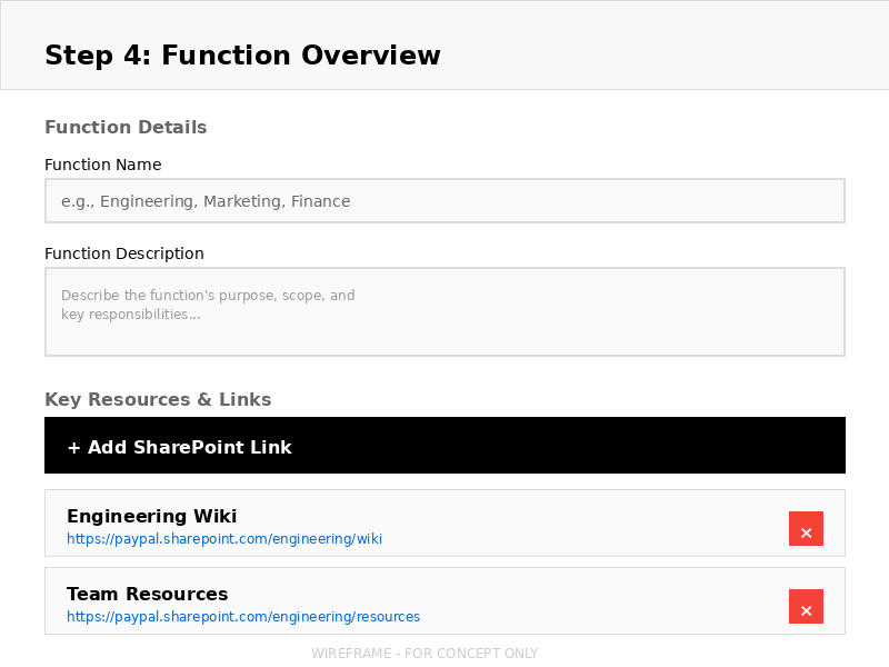
Step 4: Function Overview
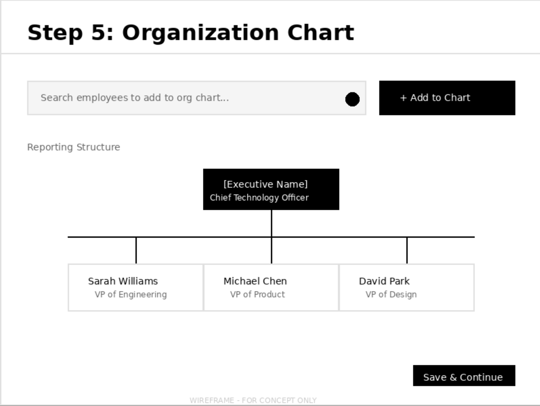
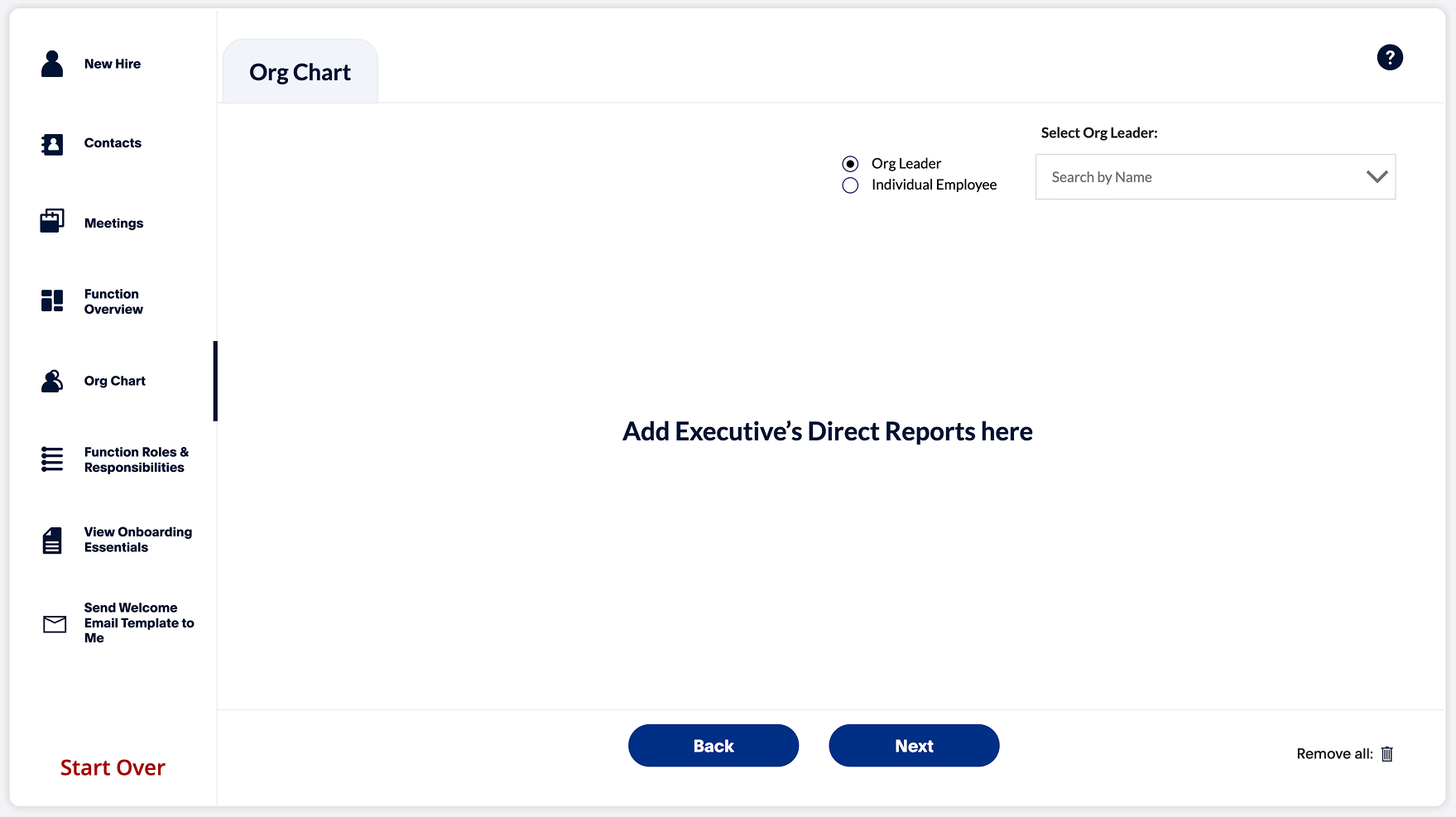
Step 5: Organization Chart
Key Design Decisions
Progressive disclosure: Break 40 pages into sequential steps to reduce cognitive load
Save & Continue: Allow users to complete sections over multiple sessions
Search & Select: Reduce manual data entry by integrating with existing employee databases
High-Fidelity Mockups & Transformation
Working within PowerApps constraints, I transformed the fragmented 40-page PowerPoint into a streamlined digital workflow. Key strategic decisions included consolidating related pages and introducing a centralized entry point that didn't exist in the manual process.
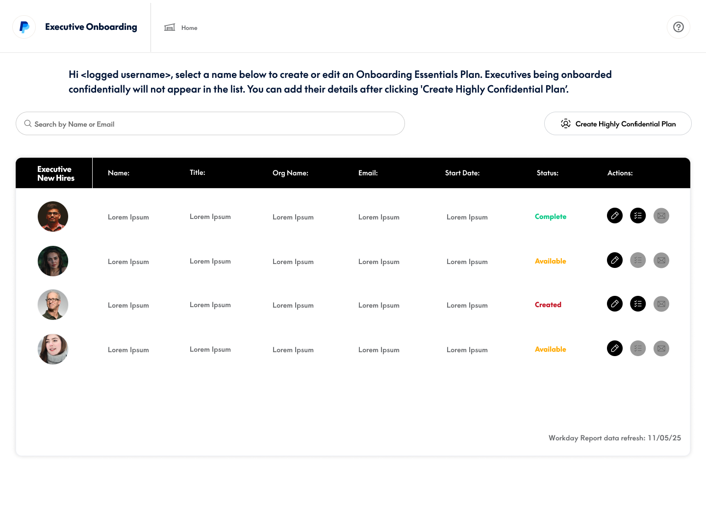
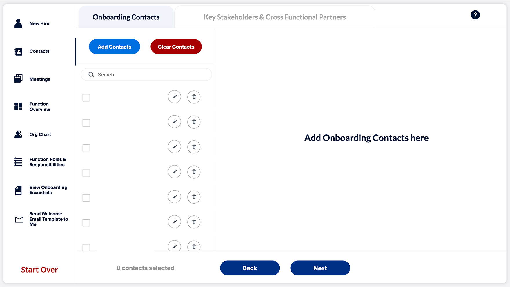
Centralized Dashboard: A Missing Entry Point
Why This Didn't Exist Before
In the manual process, there was no centralized starting point. Onboarding Partners would receive an email notification, manually download a PowerPoint template from their desktop, and spend 30 minutes on setup (creating file, following naming conventions, organizing folders).
- No visibility into in-progress profiles
- Templates stored locally (version control issues)
- Manual file naming led to inconsistencies
- No way to track who was working on what
Centralized dashboard - Entry point for all executive onboarding
The Innovation: Centralized Dashboard
Workday Integration
Automatically detects new executive hires 2 weeks in advance, eliminating manual notification tracking
Profile Management
View all in-progress and completed profiles in one place with status tracking
Role-Based Access
Shows only profiles relevant to the logged-in Onboarding Partner's assigned executives
Impact
Profile initiation time reduced from 30 minutes to 2 minutes. Onboarding Partners no longer waste time on file setup—they click the executive's name and immediately begin data entry.
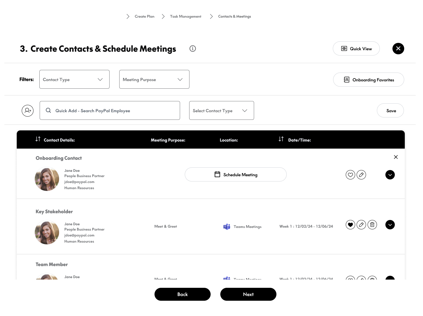
Onboarding Contacts: Strategic Consolidation
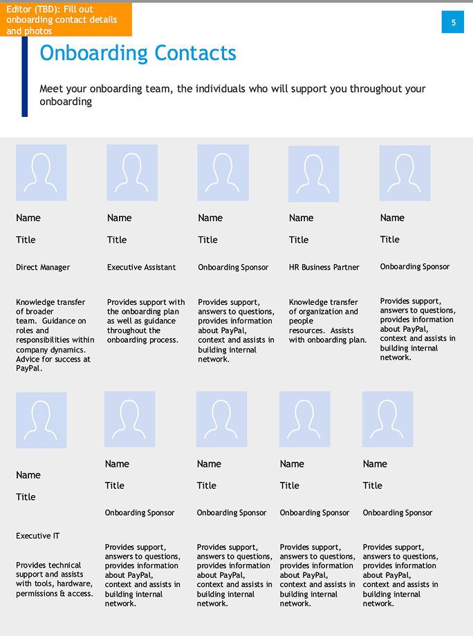 Page 1: Onboarding Contacts
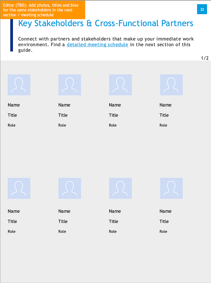 Page 2: Key Stakeholders
 Page 3: Cross-Functional Partners
Pain Points
- Scattered information — Contacts split across 3 different pages with no clear logic
- Manual photo uploads — Copy-paste photos from email, LinkedIn, or internal directory
- Data entry errors — 25% error rate from manual typing and spelling variations
- No consistency — Each Onboarding Partner formatted differently
- Duplicate effort — Same type of information entered multiple times
Key Improvements
- Unified interface — All contact types in one searchable, filterable view
- Database integration — Auto-populate from employee directory with photos
- Search & select — Type name, select from dropdown, auto-fills all fields
- Card-based layout — Improved scannability with clear visual hierarchy
- Consistent formatting — Standardized across all profiles
Why This Design Decision?
User research revealed that Onboarding Partners mentally grouped all contacts together regardless of their role type—they thought in terms of "who does this executive need to know?" rather than "onboarding contacts vs. key stakeholders vs. cross-functional partners."
Consolidating three pages into one unified interface matched their mental model and eliminated the cognitive overhead of deciding which page to use for which contact. During user testing, participants completed the contact entry task in 12 minutes (down from 45 minutes) and reported the unified view as "much more intuitive."
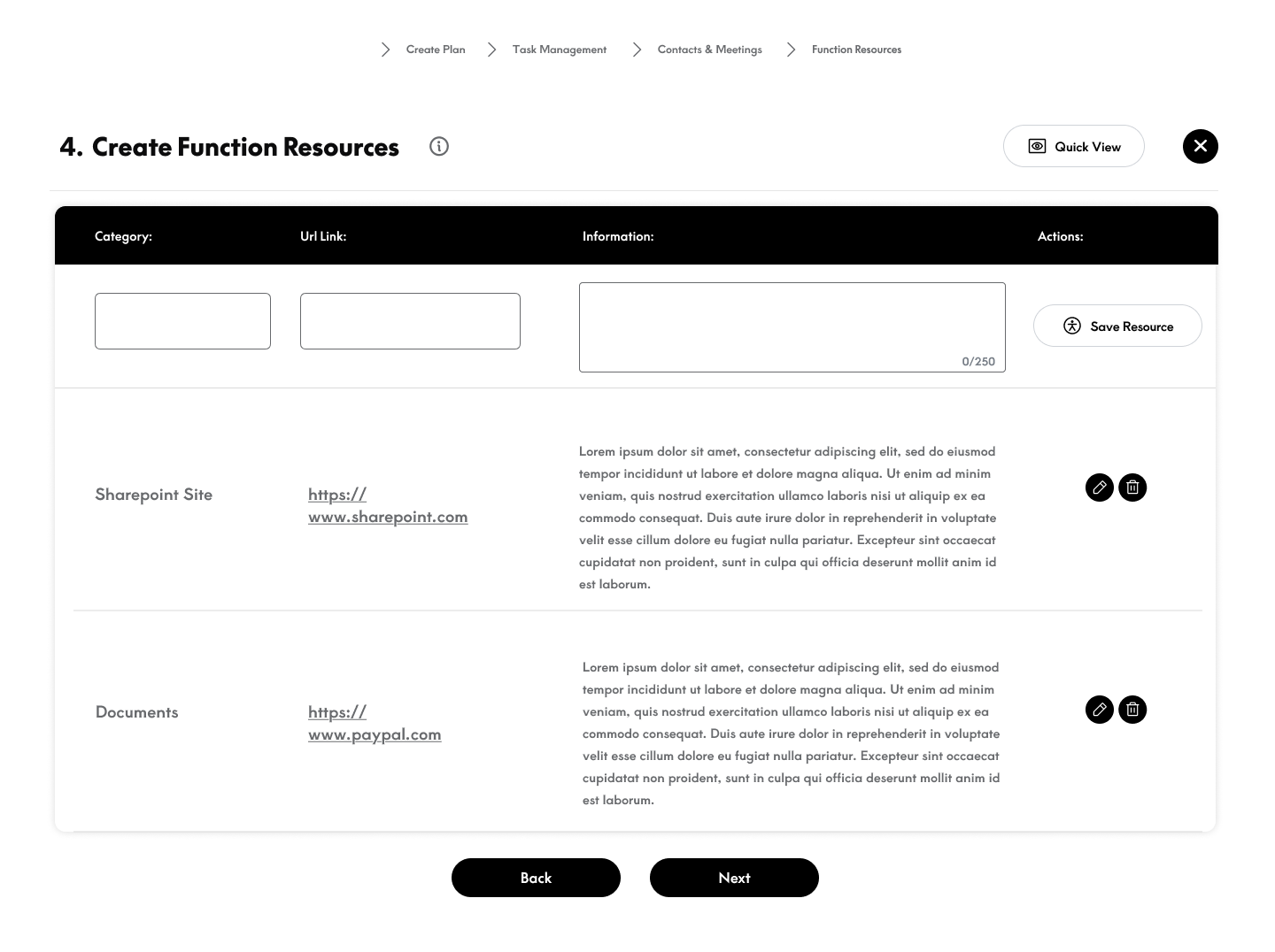
Function Overview & Resources
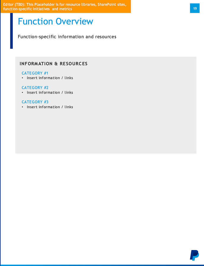
Pain Points
- Generic placeholders — "Insert information / links" required full manual rewrite
- Static text links — URLs written as text, requiring copy-paste
- No structure — Flat list with no categorization or hierarchy
- Maintenance burden — Every link change required updating every profile
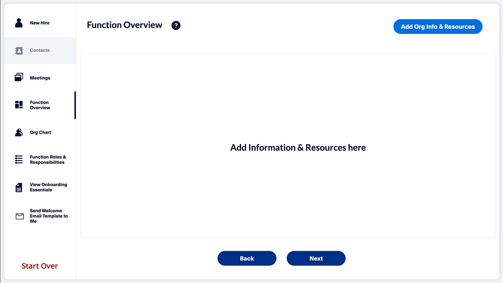
Key Improvements
- Structured categories — Pre-organized sections with clear headings
- Clickable links — Direct hyperlinks to resources (no copy-paste needed)
- SharePoint integration — Links to centralized resource libraries
- Template content — 80% pre-filled, only 20% requires customization
Why This Design Decision?
Content audit revealed that 82.5% of function overview content was static—the same links and resources applied to every executive. Only function-specific initiatives and metrics varied.
By pre-populating standard resources and integrating with SharePoint, we eliminated redundant data entry while maintaining flexibility for customization. Section completion time dropped from 1 hour to 15 minutes.
Function Roles & Responsibilities
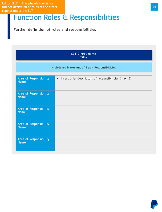
Pain Points
- Blank template — Completely empty, requiring full manual entry
- No guidance — Unclear how many roles or what level of detail to include
- Inconsistent output — Every profile looked different
- Time-consuming — Writing role descriptions from scratch took 90+ minutes
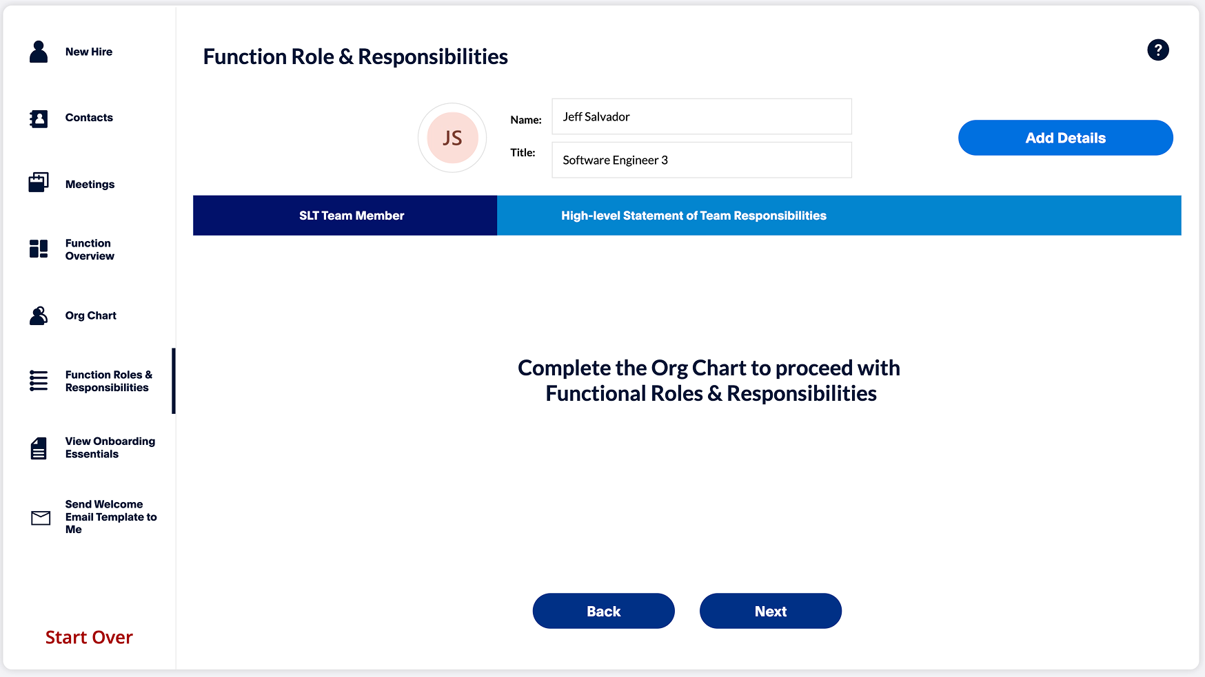
Key Improvements
- Structured fields — Clear areas for role name, responsibilities, description
- Character limits — Guidance on appropriate description length (max 5 responsibilities)
- Add/remove functionality — Dynamic rows for flexible role counts
- Consistent formatting — Standard output across all profiles
Why This Design Decision?
Stakeholder interviews revealed frustration with the blank template: "I never know how much detail to include or how many roles to list." Some profiles had 3 roles, others had 12, with wildly varying detail levels.
By providing structured fields with clear constraints (max 5 responsibilities per role), we balanced flexibility with consistency. Users reported feeling more confident in their entries, and completion time decreased by 60%.
Organization Structure: Consolidated View
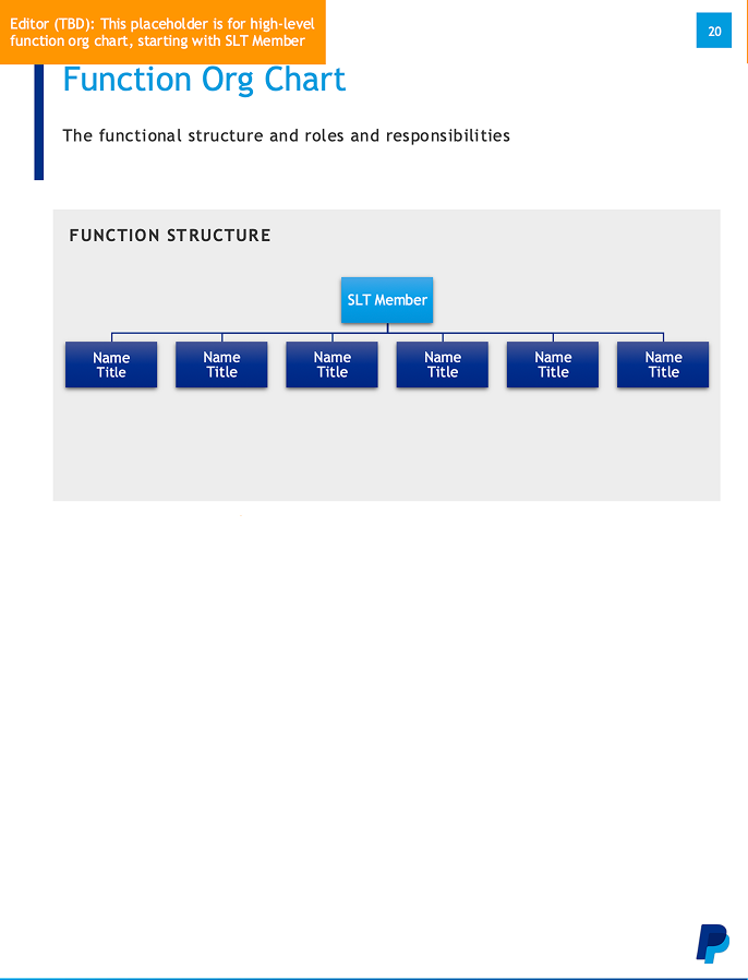 Page 1: Function Org Chart
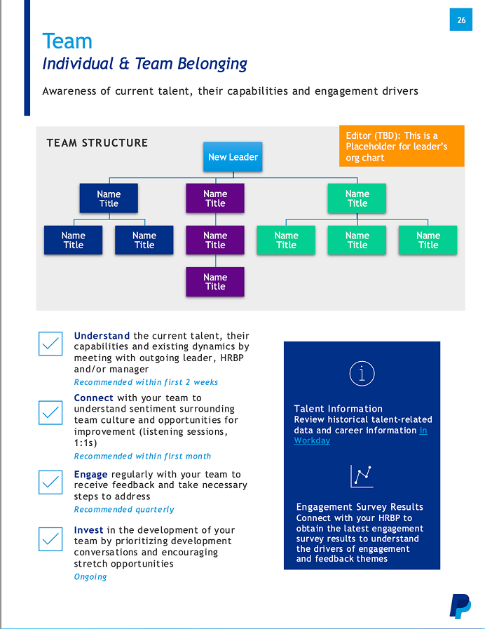 Page 2: Team Structure
Pain Points
- Duplicate information — Same people appeared on both charts
- Manual chart building — Drawing boxes and lines in PowerPoint
- Inconsistent styles — No standard formatting
- Difficult updates — Reorganizing required rebuilding entire chart
- Time-intensive — 2+ hours to create both charts
Key Improvements
- Single hierarchical view — All reporting relationships in one visual
- Auto-generated chart — Select names, chart builds automatically
- Database-driven — Pulls titles and relationships from HR system
- Visual consistency — Standardized styling across all profiles
Why This Design Decision?
Research showed that splitting organization structure across two pages created confusion: "I'm never sure which chart to put someone on." The distinction between "function" and "team" wasn't meaningful to executives—they just wanted to see who reported to whom.
Consolidating into one hierarchical chart eliminated the mental overhead of categorization. By auto-generating the chart from database selections, we reduced creation time from 2+ hours to 20 minutes while ensuring visual consistency.
Design Evolution from Wireframes to High-Fidelity
Persistent left navigation — Allowed users to jump between sections non-linearly based on UAT feedback
"Start Over" functionality — Enabled users to reset and begin a new profile quickly
Additional workflow steps — Expanded from 5 to 6+ screens based on data requirements discovered during development
Visual hierarchy — Improved button styles, spacing, and typography to work within PowerApps platform constraints
Working Within PowerApps Constraints
PowerApps has limited component libraries and specific UI patterns that differ from traditional design tools. Close collaboration with the PowerApp developer was essential to ensure designs were both user-friendly and technically feasible within the platform's constraints.
We Built This for the Wrong Users
During User Acceptance Testing, we discovered that the Onboarding Partners we had designed for were coordinators, not creators. The people who actually spent 8 hours building the 40-page PDFs were in a completely different department—the Onboarding Coordinators in the Enablement Team.
Then, before we could pivot, the company did a reduction of workforce and conducted layoffs, the entire Enablement Team was part of that restructuring. The people we should have designed for no longer worked at the company.
This discovery forced a complete redesign. See the Design Pivot section for how we adapted.
Testing & Discovery
User Acceptance Testing Revealed the Wrong Users
We conducted UAT with 8 Onboarding Partners—the stakeholders who had requested the tool. The testing revealed strong usability but exposed a critical organizational blind spot.
Usability Findings
Workflow Made Sense
Users understood the sequential flow and found the interface intuitive. No major usability issues with navigation or information architecture.
Technical Performance
Primary complaints centered on slow loading times—a technical issue, not a design problem. PowerApps performance constraints, not UX flaws.
Locked Section Friction
Users noted the I usually don't gather data for all parts of the onboarding plan.
The Critical Discovery: Locked Steps Exposed the Truth
During testing, multiple Onboarding Partners complained about the locked sequential workflow:
"I don't have information for certain sections. I want to move ahead and come back to this later."
This seemed like a simple feature request—until we dug deeper into why they didn't have the information.
The Realization
Onboarding Partners were coordinators, not creators. They didn't create the profiles—they managed the people who did.
The Actual Users
The people who actually spent 8 hours building the 40-page PDFs were Onboarding Contractors in the Enablement Team—a completely different department we had never interviewed.
The Devastating News
When we tried to schedule interviews with the Enablement Team, we learned they had been part of the lay offs in a workforce reduction. The people we should have designed for no longer worked at the company.
What This Meant
- We had designed the entire solution for coordinators who delegated work, not the people who did the work
- The locked workflow made sense for creators (sequential data gathering) but not for coordinators (who needed flexibility to delegate)
- The actual users—the ones who understood the true pain points—were gone
- We had a technically sound tool that didn't match the new reality
Our Response: Delegation-First Redesign
Rather than abandon the project, we pivoted the design to support the new reality: Onboarding Partners needed to delegate tasks to existing employees, not complete everything themselves.
Flexible Workflow
Unlocked the sequential steps to allow Onboarding Partners to skip sections they couldn't complete and delegate to appropriate stakeholders.
Task Management System
Added task assignment and tracking so coordinators could delegate profile sections to department owners and monitor completion.
See the full Design Pivot section for how we completely restructured the solution.
The Pivot
Designing for Resistance
The original solution assumed willing users who would own the process. The new reality required a different approach: design for users who actively didn't want to do this work.
Redesign Strategy
Minimize Their Burden
Reduce the Onboarding Partners' role to bare minimum: just initiate the profile and coordinate.
Distribute the Work
Push tasks back to the departments who owned the information (IT, HR, Facilities). They already had the data—make them enter it.
Add Visibility
Create a task management system so Onboarding Partners could track progress without doing the actual work.
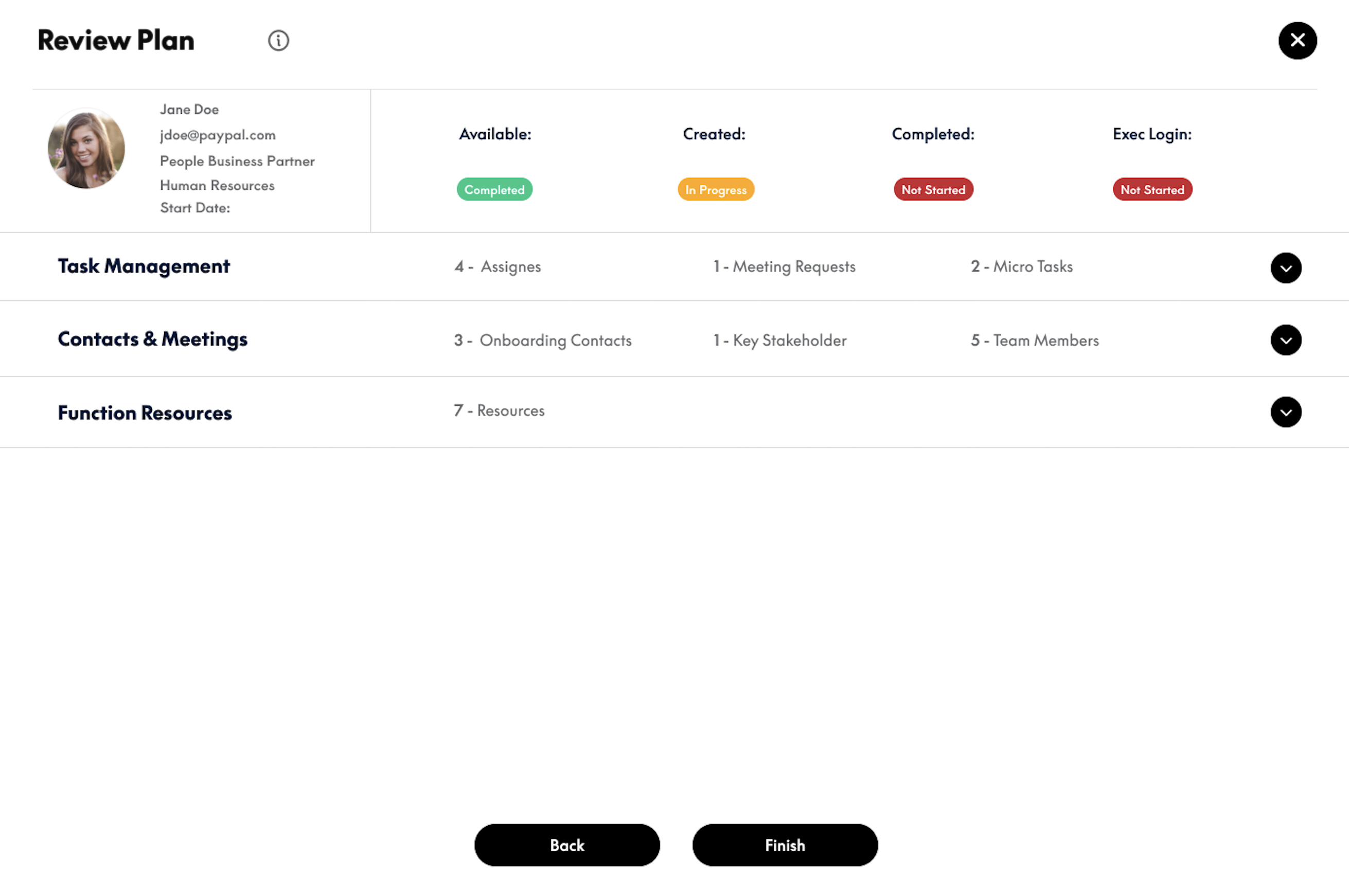
The Key Innovation: Task Management
The breakthrough was adding a Task Management feature that turned the portal from a data entry tool into a coordination platform.
How it works:
- Onboarding Partner creates a profile and assigns tasks to department owners
- Each department receives a notification to complete their section
- Onboarding Partner tracks all tasks from a dashboard—no micromanaging needed
- System automatically compiles the profile once all sections are complete
Why This Worked
By making the tool about coordination rather than creation, I aligned the design with what Onboarding Partners actually wanted to do. The resistance disappeared because I wasn't asking them to take on work they didn't want—I was giving them a tool to delegate it effectively.
Final Solution
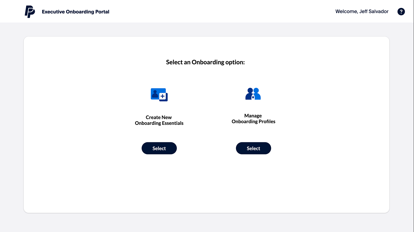
The Executive Onboarding Portal
The final solution transformed a 40-page manual process into a collaborative digital workflow that distributed work across departments while giving Onboarding Partners full visibility.
Interactive Prototype
Click through the prototype to explore the workflow
Impact
Results & Outcomes
From 8 hours to 2 hours per profile
40 pages streamlined into 4 digital steps
All executive onboarding now uses the portal
Work distributed across teams
Qualitative Feedback
Business Impact
By reducing onboarding time by 75%, the organization avoided hiring 2-3 additional full-time staff members—saving approximately $200K-300K annually in labor costs.
Reflection
What I Learned
Organizational politics are real design constraints
This project taught me that understanding power dynamics, process ownership, and resistance to change is just as important as understanding user needs. The best design isn't the most elegant—it's the one that actually gets used.
Resilience beats perfection
We designed for the wrong users, discovered this right before launch, faced organizational layoffs, and still delivered a solution that processed 350+ executives in its first year. Success came from adaptability, not from getting it right the first time.
Technical knowledge accelerates collaboration
My PowerApp development experience allowed me to design solutions that were both user-friendly and technically feasible, preventing costly rework and enabling productive conversations with engineering.
The best features often come from constraints
The Task Management feature—our project's key innovation—only exists because users refused to take ownership. Sometimes the most valuable designs emerge from working with resistance rather than against it.
What I'd Do Differently
Validate user roles earlier
I should have pressed harder to observe the actual document creators, not just the coordinators. A more thorough stakeholder mapping would have revealed the true users upfront.
Establish metrics from day one
While we tracked time savings, I wish I had set up more comprehensive analytics: task completion rates, bottleneck identification, user satisfaction scores. These would strengthen the business case and guide future iterations.
Document the design system better
With more time, I would have created comprehensive design system documentation for future designers and developers working on the portal.