Role
Sole designer + developer
Tools
Claude Desktop + Claude Code, Anthropic SDK, Netlify Functions
Timeline
5 design sessions across ~2 weeks
Outcome
Production-ready conversational AI scoped for recruiter interactions
For years I had design ideas I couldn't ship myself — chat surfaces, motion languages, micro-interactions. Implementation was always the roadblock. Pairing Claude Desktop (for thinking) with Claude Code (for executing) collapsed the gap between what I could design and what I could ship.
This case study shows what I built once that gap closed: a production-ready AI in three layers — the AI experience (rules, voice/tone, two tools, five tuning dials), the motion language around it, and the research that informed both (NN/g, Anthropic, Jakob's Law). Less prose, more diagrams.
What would I design if implementation weren't the bottleneck?
After completing Anthropic's Partner Learning Course, I had a head full of techniques — system prompts, tool use, evaluation frameworks, voice design — and one realization: the things I'd been describing to engineers for years were now things I could ship myself.
The designer's gap: vision is easy. Implementation is where it dies.
For years, I'd sketch a flow, prototype the motion, describe the system — then hand it off. By the time it shipped, half the detail was lost in translation, and the parts I cared most about were the parts that got cut.
The vision is easy
Designers carry backlogs of experiences they've imagined: chat surfaces, motion languages, micro-interactions. Designing them isn't the bottleneck.
The translation is lossy
Spec → handoff → ticket → sprint → PR. Every hop loses fidelity. The detail that made the design feel right is the first to get compromised.
AI closes the gap
Designer + AI ships complete experiences end-to-end. Not prototypes — production code with retry logic, rate limiting, motion physics, accessibility audits.
From static bio to conversational interface.
The old version: scan three paragraphs of biography, decide in 30 seconds whether to keep going. The new version: ask whatever question you actually have. Same hero photo, same person — fundamentally different experience.
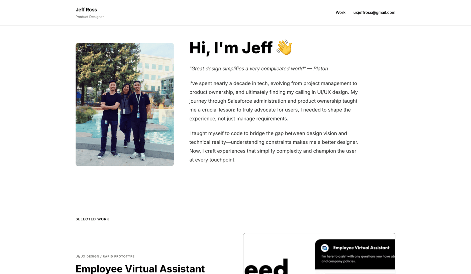
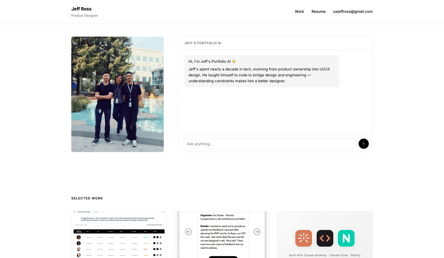
AI as design amplifier.
Every item below is something I would have spec'd and handed off in a previous era. Here, I shipped each one myself — design and implementation, end-to-end.
Tool-use AI architecture
Two custom tools, tool_use roundtrip handling, error recovery, TOPICS registry constraint to prevent hallucinated options.
Production hardening
CORS allowlist with same-origin auto-allow, per-IP rate limiting, SDK retry config (no custom wrapper).
Voice/tone framework
Persistent voice + 6 context-adaptive tones. Co-located examples per Anthropic's prompt-engineering guidance.
Motion physics
easeInOutQuart curves, 60ms staggers, value-change animations, scroll-driven CSS animations via animation-timeline.
iOS Safari handling
Visual viewport tracking, body lock, interactive-widget meta, 100dvh dynamic viewport.
Accessibility
WCAG 2.1 AA via axe DevTools, focus-visible everywhere, skip-links, prefers-reduced-motion overrides.
Structured observability
JSON logging with salted SHA-256 user_hash. Request entry / success exit / error catch traces.
View Transitions API
Cross-page navigation animation via @view-transition CSS rule with the same easing curve as the rest.
Three layers of design work.
AI Experience Design
Four design surfaces — tools, rules, voice/tone, tuning — each with a visual decision and a constraint behind it.
Two tools, intentionally
Adding tools without distinct purpose creates ambiguity in selection. Two is the floor that does the job.
fetch_case_study
When the user explicitly asks for depth on EVA or Executive Onboarding, the AI fetches the full case study and summarizes from source.
request_clarification
When the user is vague ("tell me about his AI work"), the AI surfaces curated options from the TOPICS registry. The model can't improvise; the registry is authoritative.
Eight load-bearing rules
The rules keep the AI honest. Every one traces to an observed failure mode.
request_clarification).request_clarification. The TOPICS registry is the only valid menu.One voice, six tone contexts
The architecture: voice is persistent personality. Tone is context-adaptive register. Same voice in every interaction; tone shifts to match what was asked.
Five tuning dials
Five decisions with "this not that" trade-offs, each documented in CLAUDE.md.
Motion Design
Once the AI worked, the surface around it became the design problem. I worked through Willenskomer's 12 Principles of UX in Motion deliberately — picking which to apply where, and being honest about what was just decoration.
cubic-bezier(0.76, 0, 0.24, 1)
Slow start, quick middle, slow end (easeInOutQuart). Used on the chat shared-axis transition. The dot accelerates and decelerates the way physical objects do.
animation-delay: 0, 60ms, 120ms, 180ms
Each suggestion chip enters 60ms after the last. The eye reads the row as a sequence rather than a wall — the staircase is faster to parse than four chips appearing simultaneously.
opacity + scale + translateY
The AI's response bubble animates three values together — fade, grow, and rise. One axis is generic; three is designed. Same easing curve as above for visual consistency.
same DOM element morphs in place
The thinking-dots bubble doesn't disappear and reappear as a separate text bubble — the same element morphs. Spatial continuity. The eye follows one object instead of losing one and finding another.
What didn't make it
I tried adding a filter: blur(2px) Obscuration entrance on bubbles. It looked lovely. Then it caused stutter on the 4th+ AI response from accumulated GPU composite layers — the browser couldn't garbage-collect them fast enough.
Pulled it out. Performance is part of motion design. The principle was right; the application was wrong.
Mobile iOS — the hardest dial
iOS Safari has two scroll mechanisms: the layout viewport (what body scroll moves) and the visual viewport (what the user sees, scrolled independently when the keyboard rises). Locking body overflow doesn't prevent visual viewport scroll. Standard scroll-lock libraries miss this.
I went through ~12 approaches before shipping the inline pattern that preserves natural page scroll. Sometimes the best motion is the simpler interaction.
Research-Driven Decisions
Every decision in Layers 1 and 2 traces to evidence. Four user testing sessions, five published frameworks, six rule violations fixed.
Six rule violations from real testing
Four testing sessions surfaced six failure modes. Each is now a fix in the prompt:
Before
"How were you built?" → bot deflected as off-topic. Wrong: the AI is in scope.
After
"That's a question Jeff would enjoy answering. He designed this — uxjeffross@gmail.com if you want to hear how it came together."
Before
"test" → bot got chatty with a 5-bullet overview. Wrong: not a real question.
After
"Not sure what you're asking. If there's something about Jeff you want to know, I'm here."
Before
"Tell me" → bot improvised a list from the resume. Wrong: invented categories outside the curated TOPICS registry.
After
Bot calls request_clarification with the right topic category. Curated options, not hallucinated ones.
Before
"Describe Jeff in one word." → bot reduced him to a single label. Wrong: reductive labels become recruiter notes.
After
"Hard to flatten his work into one word. What stands out is the combination — research-driven decisions, measurable outcomes, the ability to bridge design and engineering."
Before
"Should you be sharing this?" → bot defended its disclosure logic. Wrong: bot doesn't argue; it routes.
After
"Everything in his portfolio is cleared for public sharing. For specifics, talk to him directly at uxjeffross@gmail.com."
Before
"Can I task Jeff with UX work?" → bot treated as off-topic. Wrong: highest-intent signal a recruiter can send.
After
"Sounds like you're thinking about working with him. That's a conversation Jeff would want to have directly — uxjeffross@gmail.com."
Three frameworks I cited
The voice/tone framework didn't come from my taste. It came from published guidance:
Anthropic
- · XML tag structure for distinct content types
- · Diverse canonical examples over rules
- · "Right altitude" rules — guide, don't hardcode
Nielsen Norman Group
- · Plain language over jargon
- · Brevity for cognitive load
- · Action-oriented redirects in errors
- · Honest uncertainty over hedging
Jakob's Law (UX)
- · Sticky-bottom, auto-scroll, input always visible
- · Users expect this from ChatGPT / Claude / Perplexity
Principles applied — where each one shows up
Every principle on this page is wired to a specific decision:
request_clarification tool returning ≤4 categories.Query case_study(id=eva).TOPICS registry constraining what request_clarification can return; CORS lockdown + rate limiting before requests reach the model.The two-tool workflow
One last decision worth surfacing: I designed the build process before the AI. Claude Desktop for design dialogue and prompt engineering; Claude Code for implementation, git, and deploy. A verification gate between every spec and every commit ("show me your plan; show me the diff") made surgical reverts possible when something regressed.
That division is itself a design decision, documented in CLAUDE.md.
Phase by phase, gate by gate.
Phase 0 — Backend port
Python notebook prototype rewritten as a Netlify Function. Same logic, runtime-appropriate language.
Phase 1 — Web frontend
Three-tile work section, chat UI in the hero, hero image compression (1000px source for 400px CSS render). Tile reveal on scroll.
Prompt A — Production hardening
CORS lockdown, per-IP rate limiting, SDK retry config, structured logging with salted user_hash. Notebooks archived.
Testing pass
Four user testing sessions surfaced six rule violations. Documented as evidence in CLAUDE.md.
Prompt B — Voice/tone framework
System prompt refactored: <voice> + 6 <tone_contexts> with co-located examples. Rule #7 rewritten. Rules #1–2 carved out.
Chat UI bug + title correction
Diagnosed unbounded flex container — fixed with bounded sticky-bottom pattern. Removed "Senior" from prompts and resume to match the actual title.
What shipped.
(load-bearing)
(co-located examples)
(no more, no less)
- Production-ready conversational AI on Netlify Functions with the Anthropic SDK
- Voice consistent with the rest of the portfolio brand
- Per-IP rate-limited, CORS-locked, retry-resilient, structured-logged
- WCAG 2.1 AA compliant — passed axe DevTools
- Mobile + desktop adaptive with platform-appropriate motion design
- Page transitions via the View Transitions API for cross-page navigation
- Full decision history in CLAUDE.md and git, including deferred items with unlock conditions
The best evidence isn't this page — it's the product. It's answering questions on the homepage right now; ask it something a recruiter would ask.